Case study · PepsiCo · FritoLay field sales
From stale dashboards to decisions in the field
Shipped · Live across North America · Screens simplified for NDA
My first programme at PepsiCo: turning a slow Power BI report into a native iPad app that 10,000+ field sales leaders rely on, and the month of research I had to argue for first.
 By Atulesh Kumar
Opening
Field leaders were fighting their own tool
Every week, FritoLay’s field teams make around 500,000 store visits across North America. Leading them are District Sales Leaders (DSLs) and Key Account Managers (KAMs), who have minutes per store to decide what to pitch, what to restock and what to fix. The tool meant to help them was a Power BI report.
It was slow. It needed a live connection in stores with poor signal. It took real training just to find the right number. Field leaders had learned to tolerate it.
When I joined PepsiCo in 2022, this was my first programme. The brief was simple: move the report to a native iPad app.
The call
I argued for a month of research first
Leadership framed it as a platform change. The more I looked, the more it looked like a user experience problem. A new platform meant new navigation, new terminology, new flows and a new mental model. If we didn’t understand how DSLs and KAMs actually worked, we would rebuild the same frustration on a newer screen.
So I proposed a month of structured research before a single wireframe. The concern was fair: a month meant later delivery and unplanned cost.
I reframed the question: what would it cost to get this wrong? I walked the business through three scenarios: the daily productivity lost by 10,000+ field leaders fighting a confusing interface, the training and support burden across 315,000 storefronts, and the risk of pushing a field workforce onto a tool that didn’t fit their day.
Put that way, an extra month looked cheap. They agreed.
A month of research turned out to be the cheapest insurance we could buy.
Research
Four findings changed the brief
I set up a local research team and sent them where the work happens: field visits, shadowing DSLs and KAMs in stores, contextual interviews and usability tests. Surveys and stakeholder interviews filled in the rest.
Four findings reframed the whole project:
01
The words were wrong.
Labels used internal business language that field teams didn’t use or recognise.
02
The “standard” flows weren’t.
Users routinely skipped multi-step sequences; there was no time for them mid-visit.
03
Desktop logic failed on a handheld.
Controls that made sense at a desk caused repeated mis-taps under pressure.
04
There was no design system for tablets.
The existing library was desktop-first and not iOS-native.
We logged every finding in a shared research synthesis, so product, engineering and data teams were designing for the same people.
Design
Every decision traced back to the field
Every design decision had to come with a reason that started with “because we found…”.
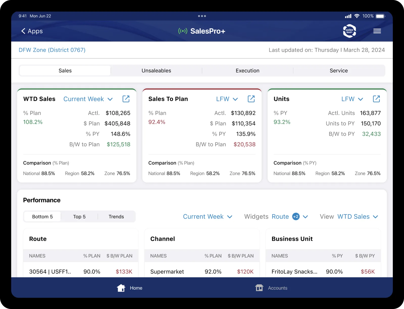
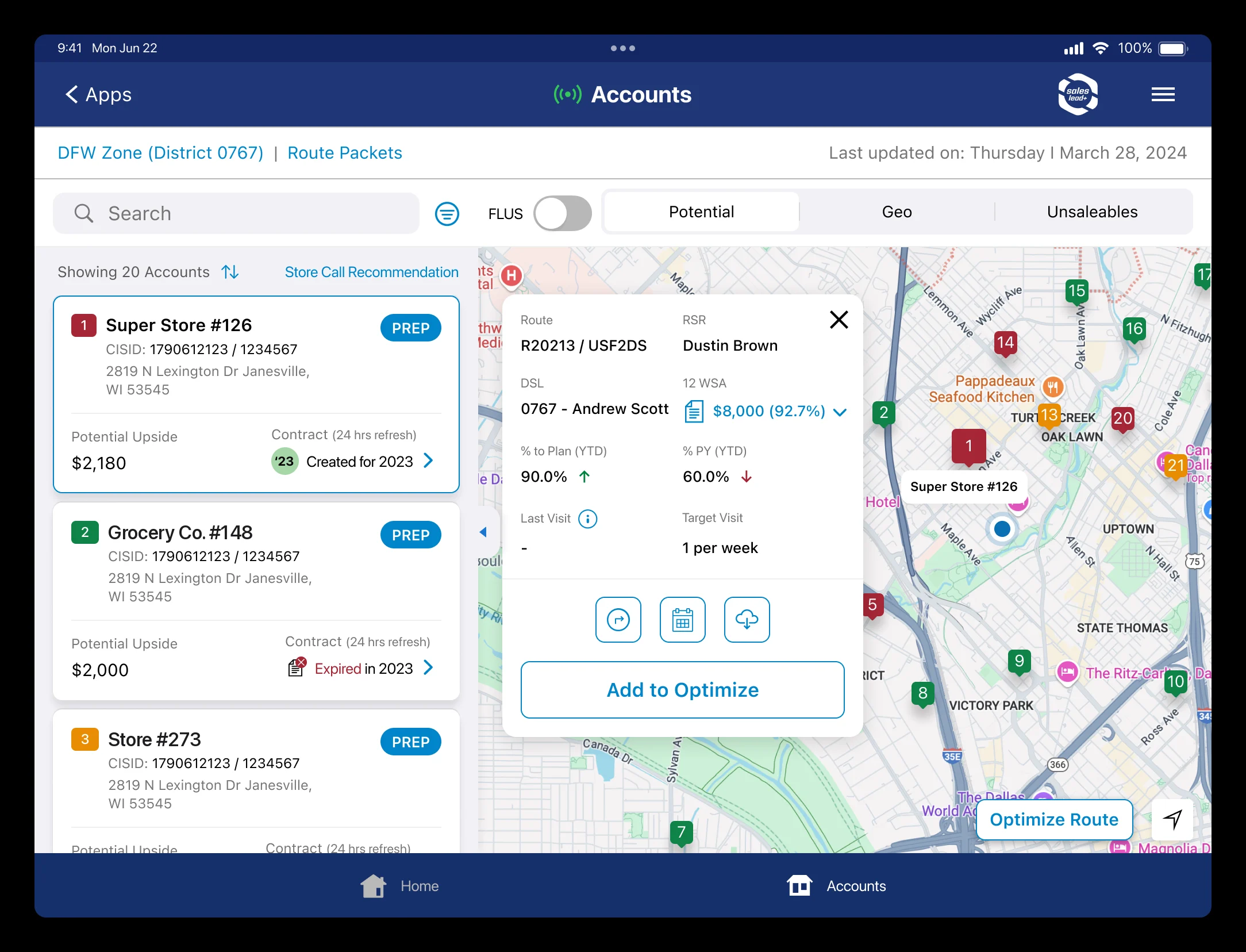
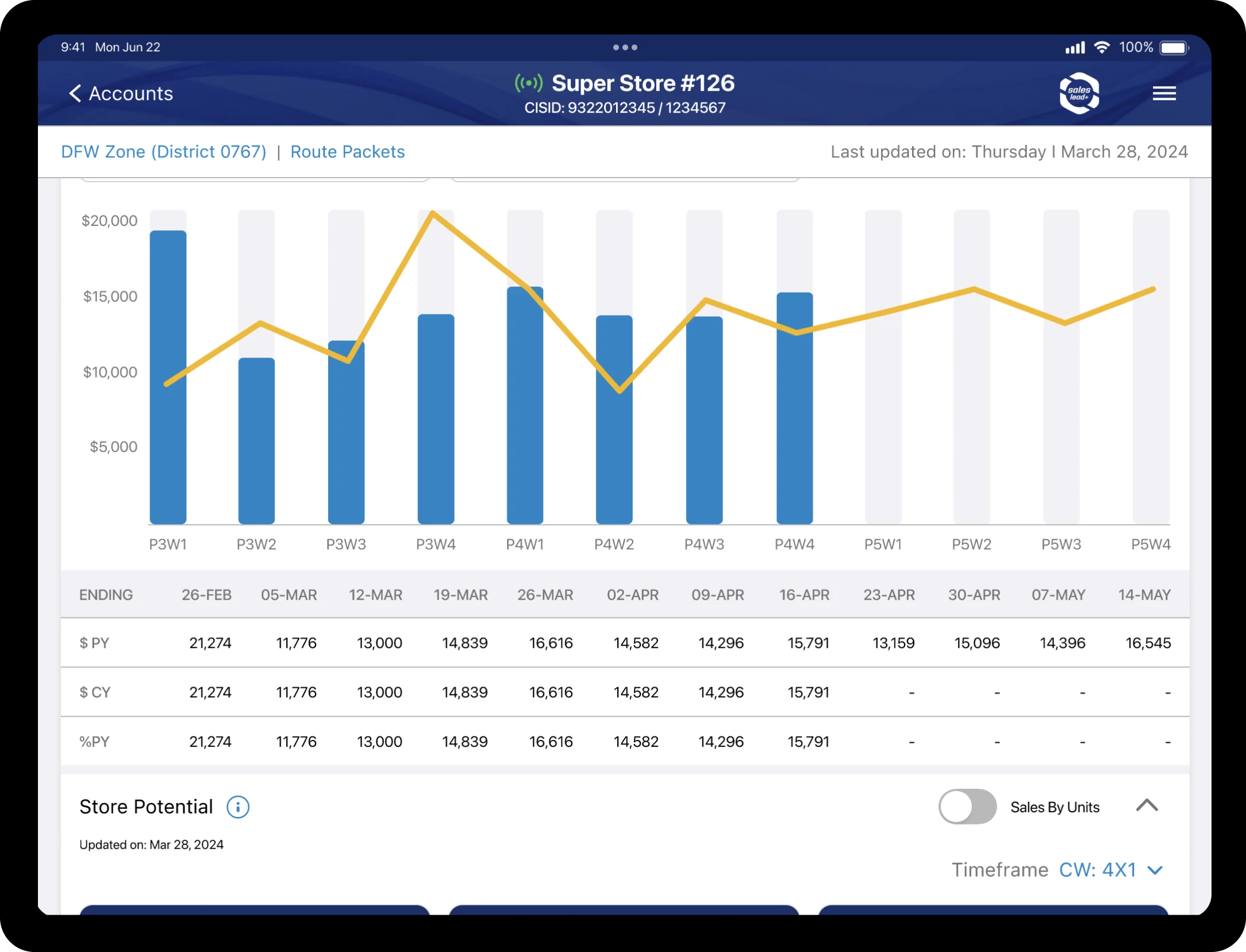
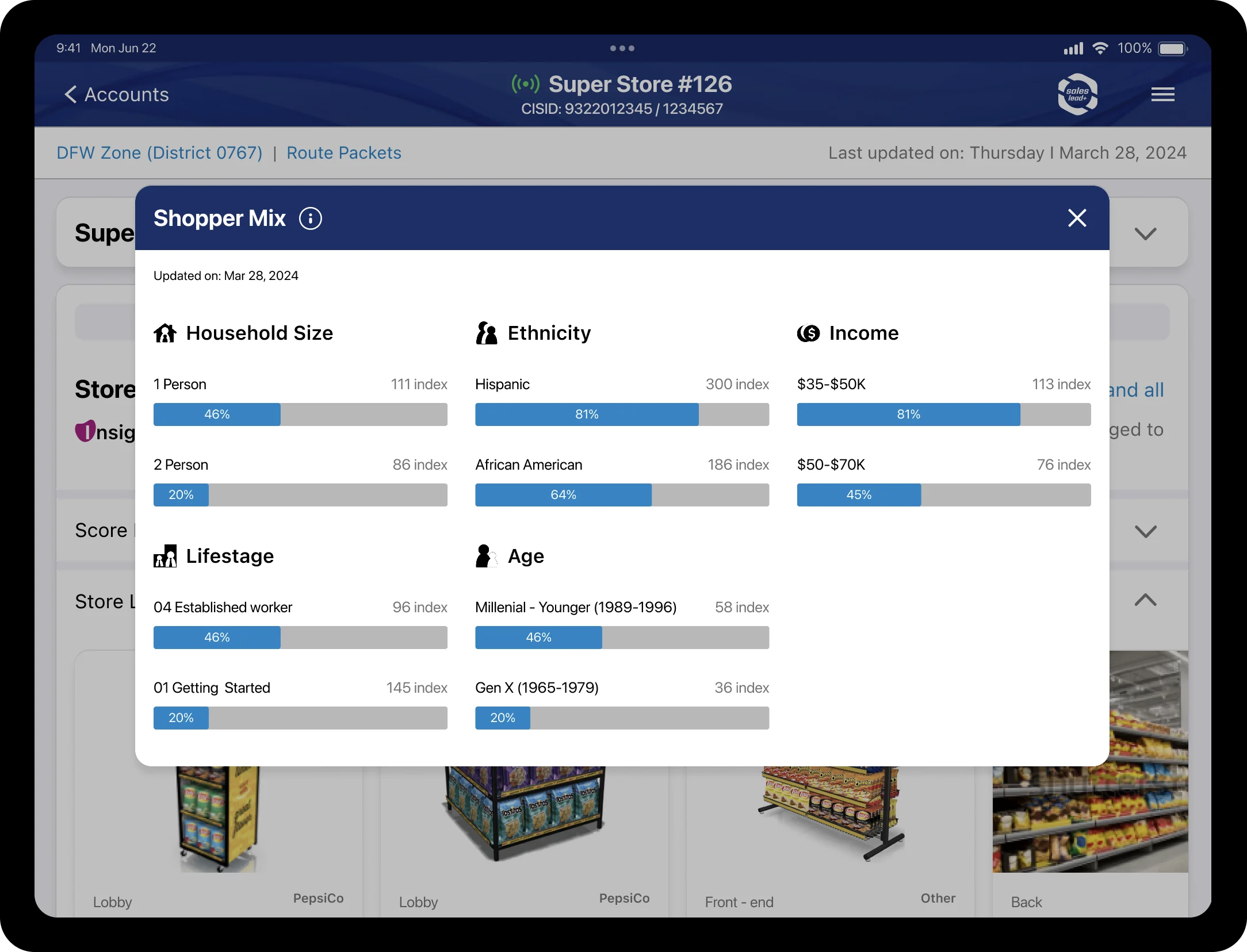
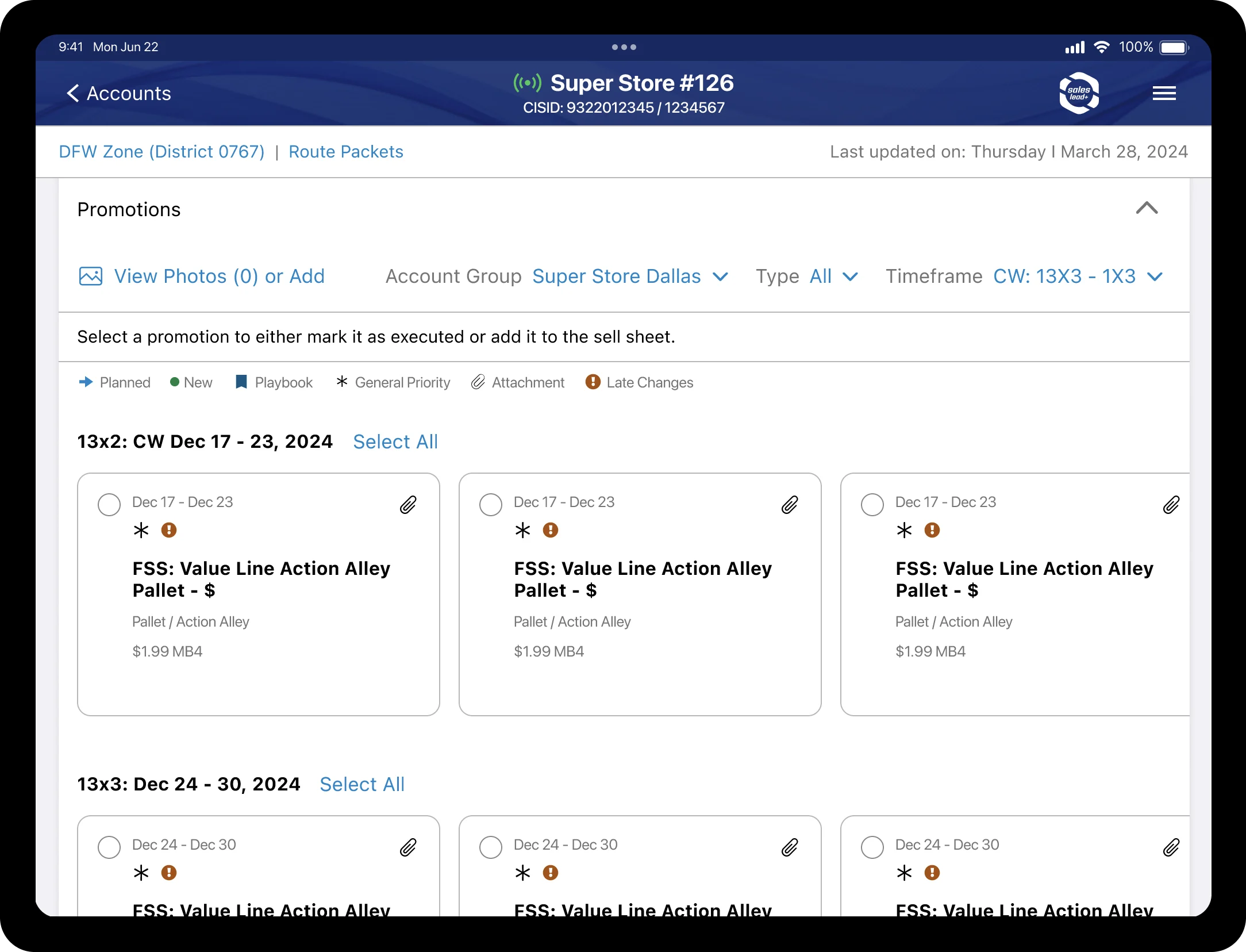
Action first, analysis one tap deeper. We rebuilt the information architecture from the field up, starting with what field leaders need during a store visit. Account health, visit priorities and sales trends became a scannable dashboard. What needed action came first; what needed analysis sat one tap away.
Offline-first. With engineering, we designed a sync model that keeps the latest accounts, routes and sales figures on the device, so the app works where the signal doesn’t.
Native and one-handed. Swipe, pull to refresh, tap targets sized for someone holding a tablet in one hand, and map-based account views for planning a route. Familiar enough to need no manual.
A design system built to scale. Reusable components, token-based theming and documented interaction standards, so engineering could grow the product without design becoming a bottleneck.
Delivery
Parallel tracks won the time back
To win back the time we’d spent on research, I ran the work in parallel tracks:
- A design pod building flows and prototypes, every decision mapped to a finding
- An iPad-native extension of the design system
- Engineering and data teams involved from day one, with regular review cadences
- Research re-engaged at every sprint release, so concepts were tested while they could still change
In Q1 2023 we piloted with 150 District Sales Leaders, using heat maps, click tracking, error logging and stress tests under real field conditions. What we learned went straight into the final refinement before rollout.
Results
+53% satisfaction and an estimated $500M+ a year
By Q3 2023, SalesPro+ was live for 10,000+ DSLs and KAMs, bringing sales insights, streamlined store visits and in-store surveys into one app.
+53%
User satisfaction compared with the Power BI baseline
$500M+
Estimated annual efficiency gains (business analysis)
315K+
Storefronts covered across North America
CIO 100
Won by the PepsiCo business team for this programme (2024)
| Aspect | Before | After |
|---|---|---|
| Platform | Power BI (web) | Native iPad app |
| Offline | None | Full offline access |
| Training | Extensive | Minimal: intuitive by design |
Field leaders told us they spent less time hunting for data and more time with customers. That was the whole point. The programme was presented to PepsiCo’s Executive Committee, which is rare for a UX-led initiative, and PepsiCo’s CTO gave me a Certification of Appreciation for Acting as Owner (2023) for delivering the design vision.
Reflection
Listen first, then build
SalesPro+ taught me that a designer’s real leverage in a big company is winning the room before the work starts. Get that right, and you earn the time to get the details right.
Launching before you’ve listened is the most expensive design decision you can make. Making that case before the money is committed is one of the most important things a design leader does.
Building something complex? Let’s talk.
Inquire