Case study · etailKart · E-commerce, India
A digital storefront for neighbourhood grocers
Client project · etailKart · E-commerce
An e-commerce platform I designed for etailKart, helping local fruit and vegetable sellers compete online, on mobile and web.
 By Atulesh Kumar
The problem
Local grocers were locked out of online shopping
In Indian cities, quick-commerce apps like Blinkit, Swiggy Instamart and Zepto deliver groceries in minutes from their own warehouses. That model works for them, and it leaves the neighbourhood vegetable seller with nowhere to stand. Partner programmes from the big platforms are complex and costly, commissions eat into thin margins, and building a store of your own takes money and technical skills most small sellers don’t have.
Market
Local stores still sell most of India’s groceries
~91%
Share of India’s grocery market held by kirana and local stores in 2025
Source: Redseer, Jan 2026
₹64,000 cr → ₹2 lakh cr
Quick-commerce gross order value, FY25 to FY28 projected
Source: CareEdge, via Storyboard18
Millions of local sellers still hold most of the market, while the fastest-growing channel is being built around warehouses they don’t own. That gap is where Grocareh! fits.
Goal
A store that’s cheap to run and easy to set up
I set out to design a low-cost web and hybrid app platform that lets small vendors:
01
Show and sell their produce online
02
Offer fast delivery to customers nearby
03
Build a fresh, healthy brand of their own
Design
Fresh produce in a few taps
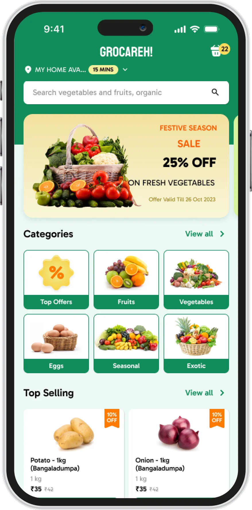
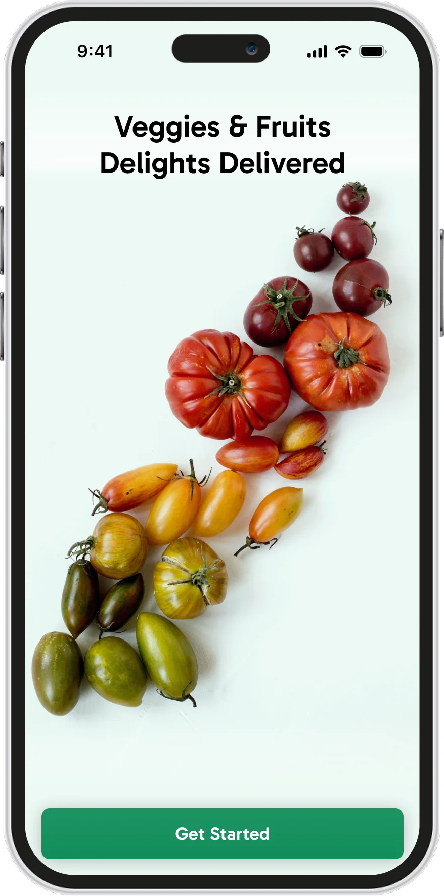
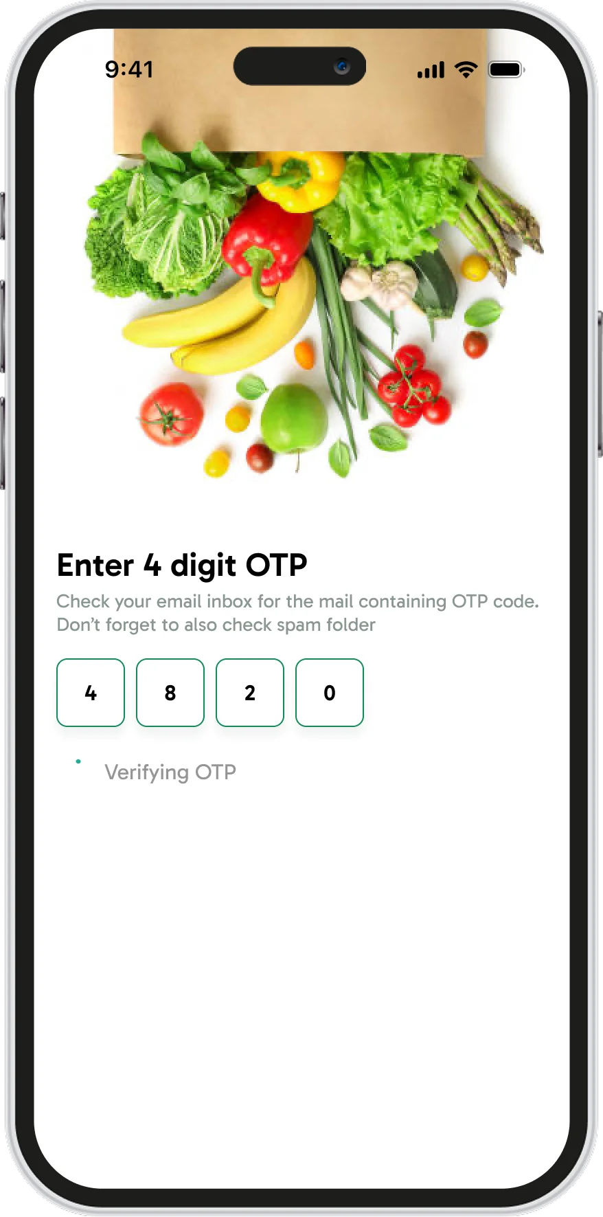
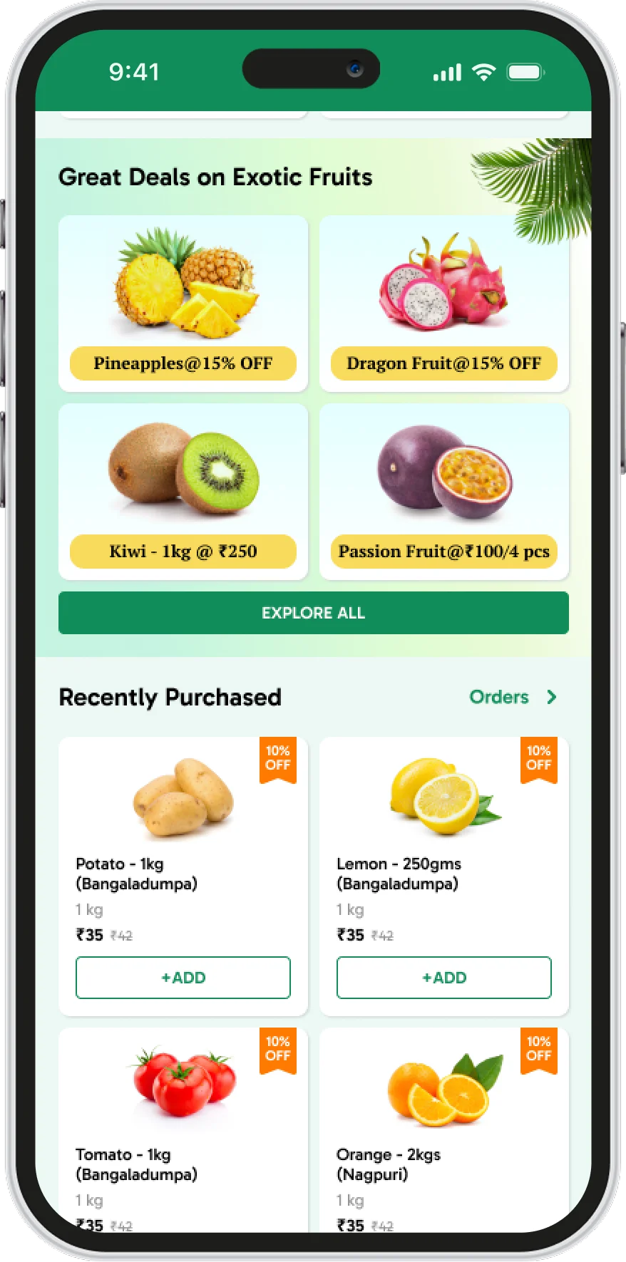
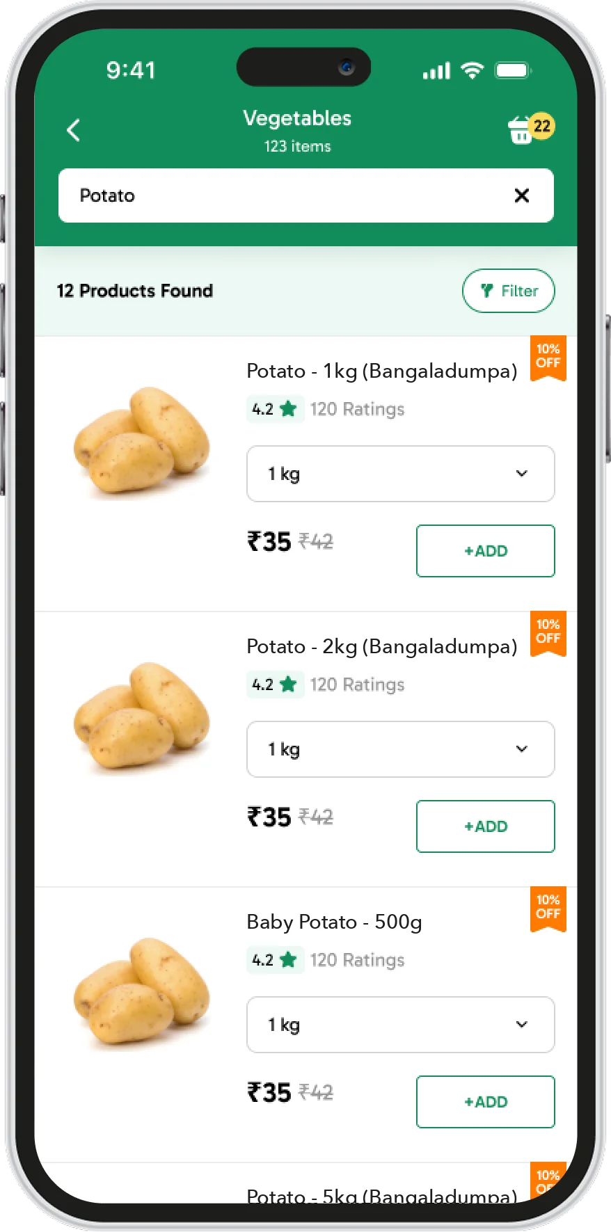
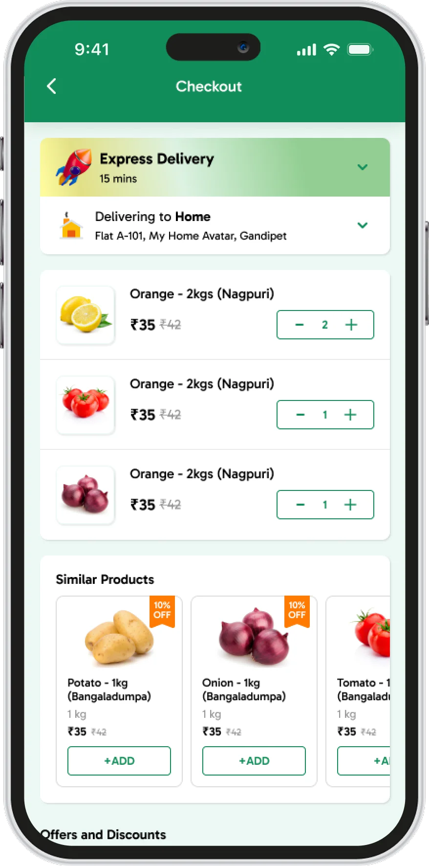
I designed mobile-first, for shoppers ordering on the go. A green palette signals freshness, and a clean, minimal interface keeps the focus on the food. Shoppers sign in with a one-time code, see delivery time and offers on the home screen, browse by category (vegetables, fruits, organic and more), reorder what they bought last time, and check out in a single screen with express delivery.
For sellers, I added quick onboarding, simple inventory management and delivery scheduling, and I kept the design light so pages load fast on any phone. Clickable prototypes let me test the flows and refine them.
Web
The same store, on any screen
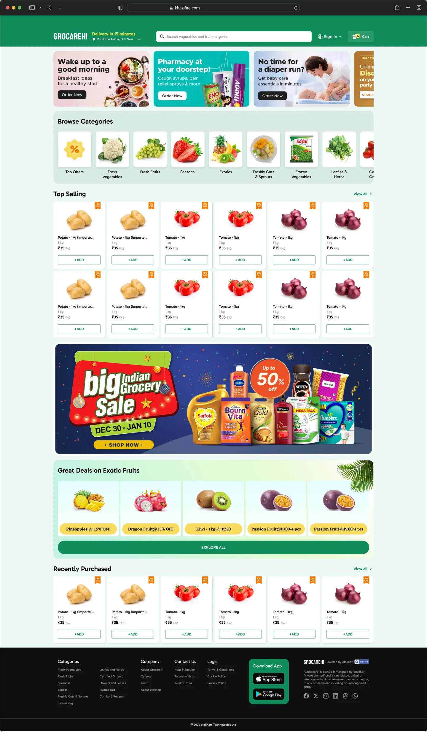
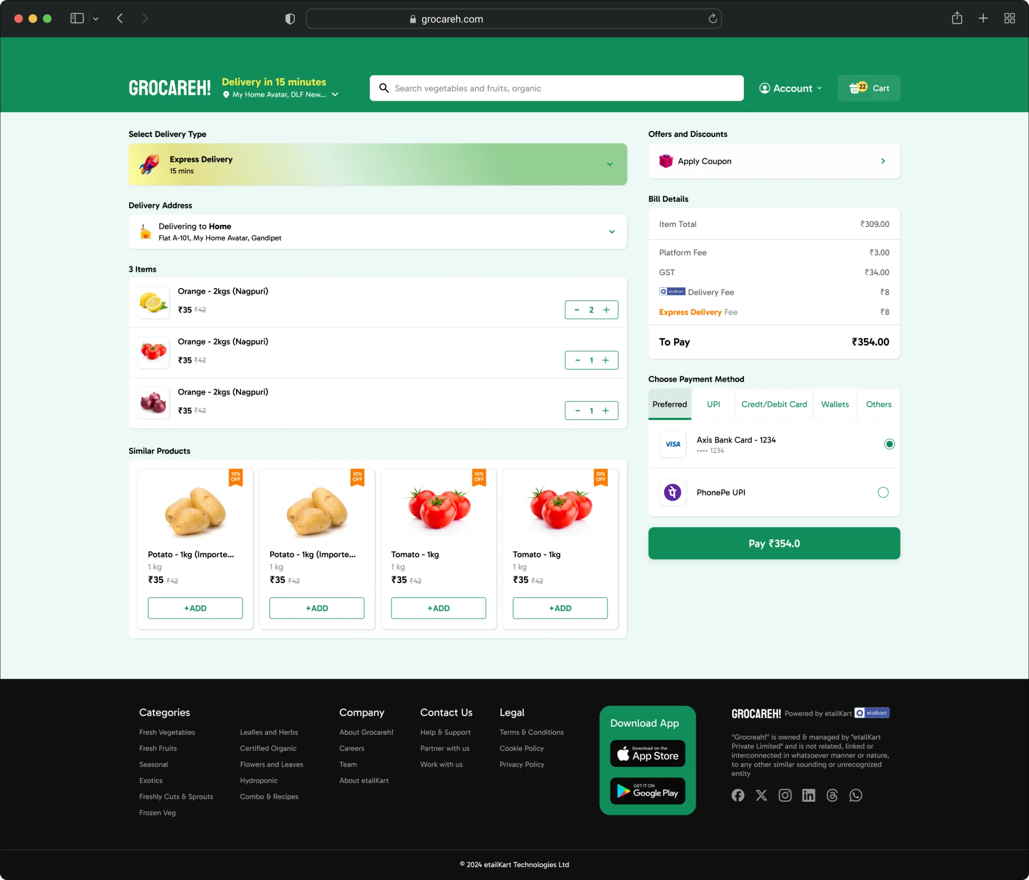
The responsive website carries the same experience to larger screens, from browsing to checkout, so a grocer runs one store that works everywhere.
Reflection
Small businesses need tools they can afford to keep
The best tool for a small business is one it can afford to keep running.
Grocareh! made me think about cost as a design constraint from the first sketch: lightweight pages, simple onboarding, and features a seller can manage alone. That same discipline helps in enterprise work, where every extra step costs time across thousands of users.
Building something complex? Let’s talk.
Inquire